
Scroll down to explore our Visual Guidelines
Background
The new visual identity for Visign is natural and Scandinavian minimalistic, but with an edge. The focus is to highlight the skills and knowledge of Visign, by letting the Visign visualizations take up space and be in the centre, and the rest of the visual identity function as a complement. The color scheme, typography and icon style are modern, elegant and professional.
1 — Logotype
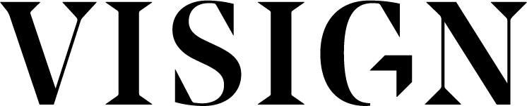
The logotype is a minimalistic, combining the text “VISIGN” with a three dimensional square in the G letter. The square is also presented in a very minimalistic way, only the shadow of the square is visible. Apart from three dimensional the square also represents rooms and square meters. The logotype comes in three colors, white, black and light grey.
1.1 — Logotype Size and Padding
The minimum size for the logotype in print is about 3 cm. On webpage no smaller than that it is still readable.
Make sure there is enough space between the logotype and the next element, such as a picture, text or other logos.
The logotype’s minimum padding size is about a ”V”- letter of the logotype, as seen in the example.
1.2 — The Don’ts
The logotype should not be used in other colors than those referred to in the guidelines.
The shape of the logotype should not be distorted, pulled or twisted out of its original shape.
Make sure there is enough contrast between the logotype and the background.
If the logotype is placed on a photograph make sure the background is tranquil and colour contrast is big enough.
1.3 — Logo Icon
The logo icon can be used in places with restricted space, that would make the official logotype unreadable. But only in cases where it is clear for the viewer it is Visign material, for instance in the Visign webpage favicon or in a profile picture on social media. Preferably with the text Visign nearby.
1 — Brand Colors
Visign have a minimalistic color scheme with different, soft grey shades, black and white. As a contrast is an edgy green color. The green color works best on screen and for printed material the neon green is replaced by a more discreet green, the Visign Print Green (if pantone colors is an alternative, the neon green shade is possible to use). Visign Print Green is only used for print material. Visign have also two attention shades, red and yellow, that are primarily used online for extra attention or error messages.
Visign Green
RGB 0 / 234 / 189
Pantone 3375
#00EABD
Visign Print Green
RGB 21 / 181 / 150
CMYK 70 / 0 / 50 / 0
Pantone 339
#15B596
Visign Light Grey
RGB 239 / 236 / 234
CMYK 0 / 1 / 2 / 6
Pantone PMS Cool Grey 1
#EFECEA
Visign Silver
RGB 198 / 196 / 193
CMYK 0 / 1 / 3 / 22
Pantone PMS Cool Grey 4
#C6C4C1
Visign Onyx
RGB 61 / 61 / 61
CMYK 3 / 3 / 3 / 76
Pantone PMS Black 7
#3D3D3D
Visign Attention Red
RGB 255 / 97 / 97
#FF6161
Visign Attention Yellow
RGB 255 / 245 / 115
#FFF573
1.1 — Brand Colors and Hues

Hues
If there is not enough colors or in need for more lighter shades, it is possibly to use hues of every colour.
1.2 — Brand Colors in Use
Underneath is a chart of how the Brand Colors is used and combined. For instance how ”Elements”, referring to the Visign logotype, lines or icons and ”Text” are used against different backgrounds. Visign primarily use the Visign Light Grey or white as the background color and the neon green as a complement for highlights or in elements. Even though the Visign logotype is in this chart as a part of the ”Elements”, the logotype is used only in white, black and grey, not green.

2 — Typography
The primary typeface combinations for Visign is Albra Display for headlines and Albra Grotesk for subheadlines and text. Secondary typefaces are Times New Roman for headline and Ariel for text. Secondary typefaces are only used when websafe fonts are needed (PowerPoint, Word…) or if the you do not have access to the primary fonts.

2.1 — Typography in Use
Albra Display Medium are the primary font for headlines, with Albra Grotesk Medium, Semi or Bold for subheadings. In the copy text Albra Grotesk Regular is used. Underneath is couple of examples. The font sizes used in the example are not necessary the right size to use everywhere. The example shows only example of how headlines and text are used in a relations to each other.

For bigger headlines the line spazing is smaller

3 — Visual Elements
The Visign identity should focus on being minimalistic as possible, but sometimes lines or icons can be the best way to lift the overall visualizations or highlight specific contents.

The thin green line can be used as a visual aid for filling out empty space, helping the reader to follow the flow or as a divider between two elements. The width of the line is about the half of the width of the headline text (when comparing to the thicker parts of the letters). This rule does not always work, for instance with very big headlines, but when the headline is about x 2,5% bigger than the copy text it works.
The line can be both horizontal or vertical. It is important that it is enough space between the line and the elements next to it, to maintain the airy and minimalistic feel. It is mostly used against a light background such as light grey and white.

A thicker green line can be used as a highlighter in text. The highlight is used in headlines or other bigger texts and cover about 50% of the hight of the headline text, starting from the descender height. In this example the bottom of the p-letter shows where the descender height is. If needed the line space between a row with highlight and the following row could be slightly bigger than normal.
Icons are made in a thin, outline style in the color Visign Onyx. They could for instance be used to portraying Services on the Visign website.
4 — Visual Identity in Use
Examples of the Visual Identity in use.


